Receiver Operating Characteristics(ROC) Curves
Starting earlier last year, I grew a strong curiosity for On-Device Deep Learning and spent some time reading about important terms that you might encounter when starting off in this field. This post and some upcoming posts will give you consolidated knowledge of the same.
In this post, I will talk about ROC curves and try to explain it with an example.
Introduction
The term “Receiver Operating Characteristic” has its roots in World War II. ROC curves were originally developed by the British as part of the Chain Home Radar System.
ROC analysis was used to analyze radar data to differentiate between enemy aircraft and signal noise (e.g. flocks of geese). As the sensitivity of the receiver increased, so did the number of false positives (in other words, specificity went down). ( that’s pretty cool though i personally didn’t knew this, just found out during perusing some articles :p)
Deep Dive
In Modern era of Deep Learning, ROC curve is a graph showing the performance of a classification model at all classification thresholds. It is used to determine the best cutoff value for predicting whether a new observation is a failure or a success.
- But what is this cutoff value ?
When you choose a classification cutoff (let’s say 0.5), you are saying that you would like to classify every observation from the model with a predicted probability greater than or equal to 0.5 as a success. You will classify observations meeting this criteria as a success regardless if that outcome was actually observed to be a success.
Weird right? Why would you do that ?
In classification models, the observed outcome can ONLY be 0 or 1 for a particular class whereas the predicted probabilites can take ALL values between 0 and 1. So, for a given datapoint, the predicted probability from the model may have been 0.51 (51% probability of success), but your datapoint was actually a 0 (not a success).
Each dot on the curve represents a different possible cutoff value for classifying predicted values. You could feasibly pick any value between 0 and 1 as the cutoff, but doing this manually for every possible meaningful cutoff value would be quite an exhausting task, won’t it be ? That’s where ROC curves come into picture. So what an ROC curve does is looks at every possible cutoff value that results in a change of classification of any datapoint in dataset.
If there is a change in classification, a dot is placed on the curve.
Whatever cutoff you choose, a certain number of the rows of data will be correctly classified (you predicted the correct value for that row), and a certain number will be misclassified. Sensitivity and Specificity (explained below) are two metrics for evaluating the proportion of true positives and true negatives, respectively.
For ROC curves, we will need two ratios to be calculated.
True Positive Rate
It is the ratio that quantifies “of all the positive labels, how many did we classify correctly” i.e the number of True Positives divided by the total number of positively labeled points.
It is also known as Sensitivity or Recall.

False Postive Rate
It is the ratio that quantifies “of all the negative labels, how many did we classify correctly” i.e the number of False Positives divided by the total number of negatively labeled points.
It is also (1 - Specificity)

For every point on the ROC curve (representing a different cutoff value), the location of that point is plotted as the sensitivity at that cutoff value on the Y axis, and 1 – specificity at that cutoff value on the X axis. As such, the ROC curve shows graphically the tradeoff that occurs between trying to maximize the true positive rate vs. trying to minimize the false positive rate.
In an ideal situation, you would have sensitivity and specificity near 100% at all cutoffs, meaning you predict perfectly in all cases.
Example
Consider a 1-D data that we want to classify into two classes - red and blue i.e we want to find a correct split for the datapoints.
Consider the red as negatives and blue as positives.

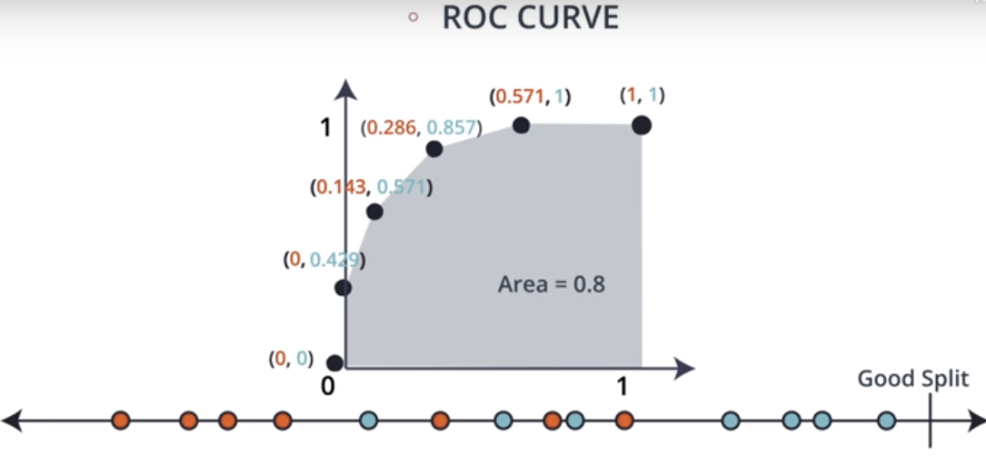
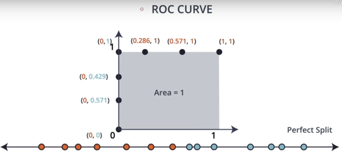
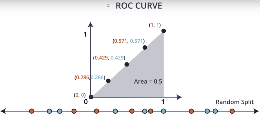
Depending upon where we make the cut on this line, the splits may be Perfect, Good or Random.

Now that we know how to calculate the two ratio’s from above definitions, let’s utilize them to plot the ROC Curves.

Take the good split data set, we calculate ROC as follows:
- Select a point from the dataset where you want to split
- Calculate the True Positive Ratio for that split point
- Calculate the False Positive Ratio for that split point
- With True Positive Ratio on the Y-Axis and False Positive Ratio on the X-Axis, plot the point on a graph.
- Loop steps 1-4 for different datapoints from the dataset
ROC curve for Good Split

Similarly, we will plot the curves for Perfect Split as well as Random Split.
ROC curve for Perfect Split

- A perfect model is represented at a point (0,1) i.e a perfect model is represented by a line that travels from the bottom left of the plot to the top left and then across the top to the top right.
- This curve shows that there is a cutoff for which both sensitivity and specificity are at 100%. Another way to state this is that there are no false positives and no false negatives.
- AUC for this ROC is 1
ROC curve for Random Split

- Random Split can be interpeted as the only way to increase the true positive rate (sensitivity) is to also increase the false positive rate (1 – specificity) by the same amount.
- AUC for this ROC is 1
Summary
- Smaller values on the x-axis of the curve indicate lower false positives and higher true negatives.
- Larger values on the y-axis of the curve indicate higher true positives and lower false negatives.
- The closer the Area Under the ROC Curve(AUROC) is to 1, the better your model is.
- ROC curves are appropriate when the observations are balanced between each class, whereas for imbalanced datasets use precision-recall curves.
- We can use the ROC curve and the AUC to assess the performance of any binary classifier.
References
For those who haven’t met me before, I am Yash, writing this article with ❤ from India.
